A page that had to match a brand it wasn’t built in
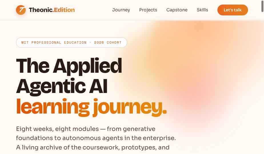
The deliverable was a public landing page documenting this course: the eight-week program, the coursework, the capstone. The constraint that made it interesting was that it could not look generated. It had to drop into theonic-edition.ai and read as though it had always been there — same cream and terracotta palette, same Bricolage and Sora pairing, same density.
So the work split into two halves that felt nothing alike. Getting to a page took one prompt. Getting to my page took a dozen — typography, spacing, palette, hierarchy — each one a description of a gap rather than an instruction to a machine.
Two prompts, then a dozen corrections
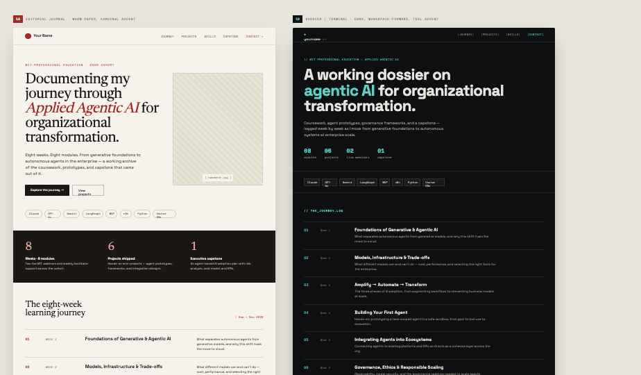
“A clean, editorial personal-portfolio homepage documenting a professional’s MIT course on Applied Agentic AI. Warm cream background, terracotta accents, a large headline, a numbered eight-week timeline, a project gallery, and a stats band. Modern, minimal, sophisticated.”
“Turn this mockup into a functioning webpage. Write semantic HTML and CSS that matches the layout, colors, and typography of my personal website theonic-edition.ai. Make it responsive, with a sticky nav, hover states, and subtle scroll-reveal animations.”
Then the loop: save the output, open it in the browser, compare it against the intent, describe the next gap. Spacing, redundant markup, and accessibility all needed review — the generated code was a strong first draft, not a finished one.
Mockup, then the running page
From production to direction
My role stopped being writing code and became judging output against intent, then describing the next correction. Quality tracked the quality of my description far more than any technical skill: vague prompts produced generic pages; specific direction — audience, tone, sections, hierarchy, brand — produced pages that were genuinely close to usable.
The skill being tested is not prompting. It is knowing what good looks like, precisely enough to describe the distance to it.
It is not automated. The output needed review for spacing, redundant markup, and accessibility. But as a way to reach a tangible, on-brand starting point in minutes rather than days, it worked — and refining afterwards was as simple as describing the change.
A release bottleneck becomes a same-day task
Every mobile app we submit to the App Store and Google Play needs a promotional page — hero, feature highlights, screenshots, download call-to-action. That used to mean briefing a designer and a developer and waiting days per app. Describing the app and its audience, generating a mockup, prompting for responsive on-brand HTML, and publishing takes under an hour — and a variant per app or campaign takes minutes more.
The same speed generalizes. Product, marketing, and sales can turn a written request into a clickable prototype of an internal tool or a campaign microsite in an afternoon, which gives stakeholders something concrete to react to instead of a document everyone reads differently.
The honest operating model is augmentation, not replacement: vibe coding for rapid prototyping and internal tooling, engineers owning production hardening, security, and scale.